What is reporting?
By definition, reporting is primarily the means and measures to collect, process, store and present information within a company. Reporting is also about reducing the complex to the essential. Thus making data accessible in a simplified way for specific target groups and stakeholders. This can be both internal and external. To this end, information relating to the company and its environment is prepared in the form of reports, hence the term “reporting”. The type of reports can be varied, but tables and diagrams are often used for presentation. It is important that the data is made available to the users in a comprehensible and clear manner.
When it comes to reporting, we often refer to the terms controlling and monitoring. Most of the time, however, the distinction is not clear. This is because all three terms are frequently used synonymously. However, there are elementary differences here: Monitoring primarily involves the supervision of various processes and can, for example, trigger an alarm as a result. Reporting aims to provide information. Monitoring and reporting run parallel to each other and describe two different processes. Controlling, on the other hand, describes the management in the company and is based on the available data. Thus, reporting is the basis for controlling and is also assigned to this area.
Why is reporting important?
For controlling, and thus also for corporate management, it is essential that corporate data is well-prepared. There are several reasons for this. On the one hand, reporting represents a transfer of knowledge within the company. Through efficient reporting, employees in other departments or in management positions, as well as top management, can quickly develop an understanding of business processes with which they are less familiar, since the data has been collected professionally beforehand and prepared in reports. Thus, reports reduce information loss in an organisation.
On the other hand, reporting is generally a good means of analysis in the company. It is the starting point for effective and efficient evaluations, on which the control and development of strategies are based. In this way, reports also directly support operational and strategic corporate management and decisions do not have to be made “on instinct”. For instance, a report can provide information on whether the marketing mix with concrete measures such as social media plans, website activities or the latest campaigns contributes to the achievement of goals and to what extent.
This is achieved since reports allow conclusions to be drawn about the published content and the associated user behaviour, as well as the general activities of the company over a longer period of time. This makes measures that are sometimes difficult to record quantifiable and qualifiable. Put simply, the questions “Does what I am doing make sense at all?” and “How successful am I?” can be answered in a substantiated way.
What needs to be included in a report?
Reporting can look different in each company, depending on what it is used for. Standard reports include types such as marketing reporting, financial reporting, sales reporting, management reporting, personnel reporting, purchasing reporting or IT reporting. Usually, these reports include areas such as balance sheets, profit and loss statements and other important key figures, e.g. from social media marketing. This creates a wealth of different ways for presentation. In order for a report to have a high informative value and to be useful to other stakeholders, it must fulfil certain criteria.
The reporting…
- … should be tailored to the target group that works with it. All information must be correct in terms of content and understood by all persons. In addition, the reporting must be written from an objective point of view.
- … must be consistent. To this end, the same terminology should always be used and the structure must not change.
- … should be designed with one or more goals in mind. Clear steering information for the recipient can only be created against the background of the target formulation.
- … must be quick and easy to create. Once the basic structure is in place, not much time should be spent on daily, weekly or monthly evaluations.
- … may only contain the key performance indicators (KPIs) required for the goals. It is important to limit oneself to the essentials and not to depict all existing key figures.
Best practice: Reporting & analysis in the field of social media
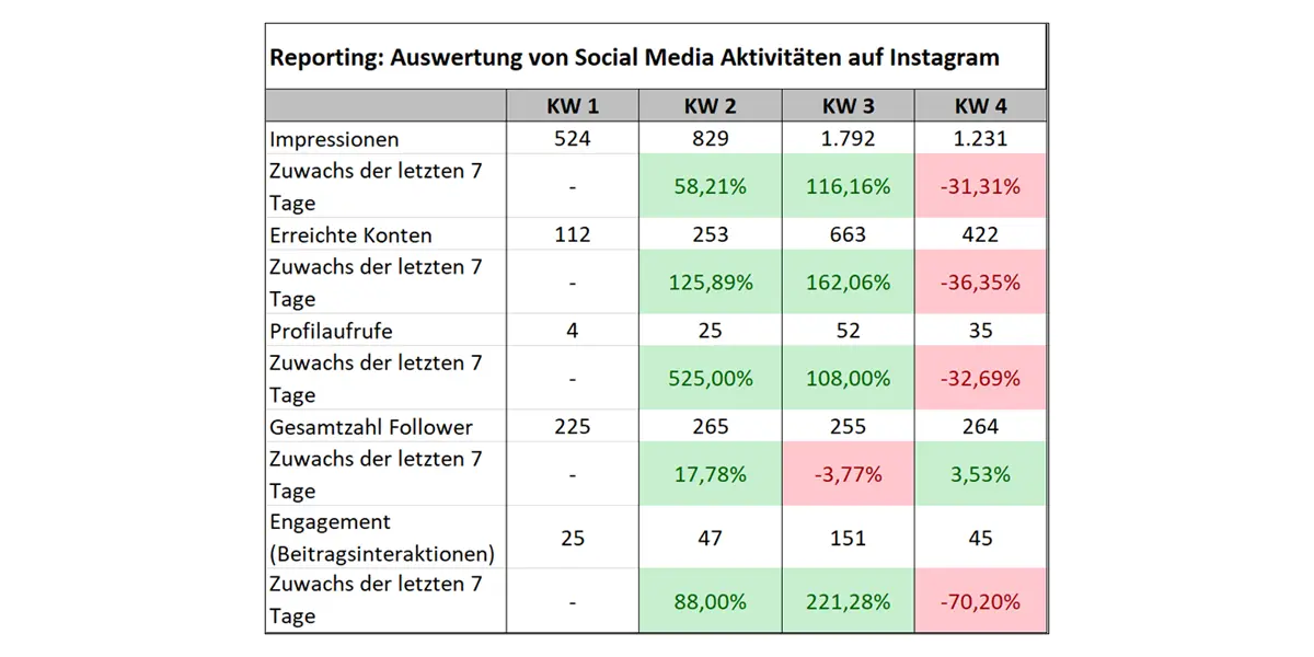
In order to demonstrate this, an exemplary report of a fictitious, already existing user account now follows, with the Instagram platform serving as the basis. The abbreviation “KW” stands for the individual calendar week in the year. In this example, a report is created for the first time in week 1, which is why no metrics exist yet regarding the increase/decrease compared to the previous week (see “Increase in the last 7 days”).
The aim is to illustrate how a table-based report can look. However, the report is only a very simplified, reduced form of reporting and deals with the key performance indicators (KPIs) typical for social media: impressions, accounts reached, profile views, followers and engagement. As an additional evaluation and aid for later analysis, the percentage changes of the KPIs compared to the previous week are already calculated. This allows initial qualified statements to be made:
This table shows how the key figures have changed over a period of four calendar weeks. Almost all areas have risen continuously. This offers a first hint that the marketing measures used are effective. However, success ultimately depends on several factors and KPIs and is measured by the degree of target achievement. If the target in this example was an increase in reach (impressions + accounts reached) over the total duration of the four weeks, then this objective has been achieved.
Identifying events quickly
It is also noticeable that the number of followers dropped significantly in week 3 compared to the previous week, although the impressions, the accounts reached, the profile views and especially the engagement rate increased. Here it is worth taking a look at the published content. Maybe users didn’t like a post or there even was a shitstorm. In any case, such events affect the key figures and show up in the reporting at the latest.
The data table and the colour-coded fields clearly indicate that extremes, both positive and negative, often only show up with a certain time delay. For example, the effects from week 3 are only clearly visible in the table in week 4. Ideally, however, serious events such as a shitstorm should not first become apparent in the reporting.
Interpreting key figures correctly
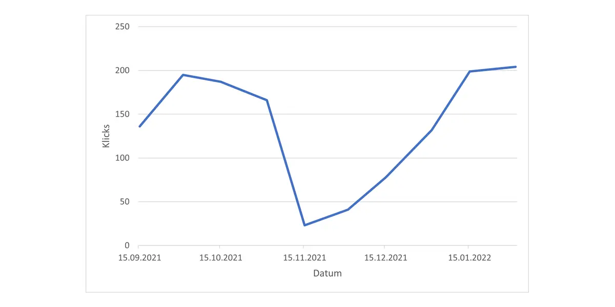
Dips in key figures can also have causes other than your own content, both on social media and in other areas. For KPIs from Google, for example, website performance is usually the decisive factor. If Google launches a new update and changes its algorithm, it can happen that your own homepage is suddenly no longer indexed. This can also be reflected in poor figures in the reporting tool or system used:
Google launched a core update in mid-November. In this example, the click numbers on the website have plummeted as a result.
Reporting with SharePoint and Microsoft 365
It’s beyond question that reporting is an important part of a company. However, the manual creation of reports can not only be tedious, but also time-consuming. Especially in large companies with a correspondingly high volume of data (keyword “Big Data”), it makes sense to manage this data in systems.
These so-called “reporting systems” are often embedded in document management systems (DMS) or enterprise resource planning systems (ERP systems). Thus, these systems contain the data basis from which the reporting system can draw its information.
Visualising data with reporting systems
Reporting systems have the task of presenting the data collected in the organisation fully automatically and visually. This can be tables, as in our social media example, or diagrams and dashboards. These visualised data help to achieve more transparency, free up human resources and create a good, fact-based overview of the current business processes in the respective business areas. In addition, the problem of data silos is avoided, and all important information is taken into account.
Microsoft 365 offers a possibility to run automated reporting with its Power Platform. The business intelligence software (BI software) “Power BI”, which is available in Microsoft 365, is excellently suited for collecting data from different systems, such as ERP and DMS systems, preparing it and creating meaningful reports. These can then be made available to all users directly in SharePoint Online. Thus, it is possible, among other things, to display incoming orders, customer acquisitions, the planning of the business year and much more in SharePoint Online.
Creating reports easily in Shareflex
It’s easy to utilise data within the Shareflex solutions by Portal Systems with the help of Power-BI and process it in reports. All solutions within the Shareflex ECM Online product suite, ranging from contract and document management to incoming invoice processing, are based on SharePoint Online and Microsoft 365. If you’d like to know more about our solutions and reporting with Power-BI in Microsoft 365, please do not hesitate to contact us. We will help you find the right solutions to digitally support and advance your business.
Hamburg, February 24, 2022
Author: Sara Glöckner
Category: Business Wiki
You like what you read? Please feel free to share this article: